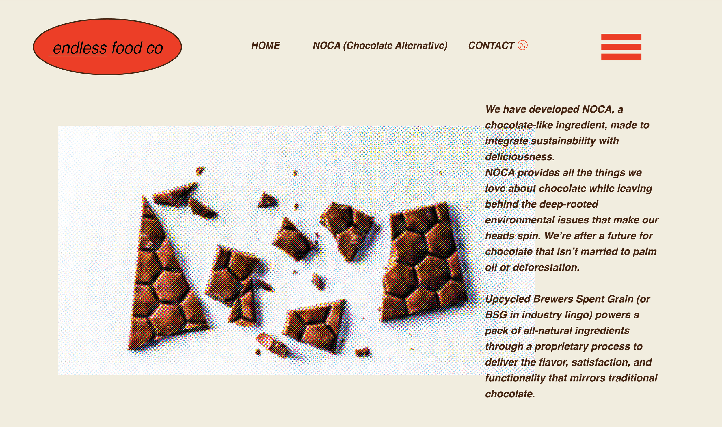
This brand development project called for a new logo system, branded materials, and digital presence. The product, cacao-free chocolate, existed only in ingredient form and was already being used by some local businesses in the area. The clients wanted to increase brand awareness and appeal to younger, conscientious consumers. In order to accomplish this, I divided the project into three phases: Market Research, Logo Ideation & Sketching, Asset Development.
Market Research
One of the first things I did when I began developing the visual identity for this brand was research. I looked over all of the information that was shared by the clients about the company, looked into articles or mentions of the product online, and found other companies that operated within a similar eco-conscious “foodie” space. In addition, I visited local bakeries and cafes to ask people about their general attitudes and values when it came to consuming products. One of the key discoveries was that younger people were generally more willing to buy a product if it had health or environmental benefits.
Logo Ideation and Sketching
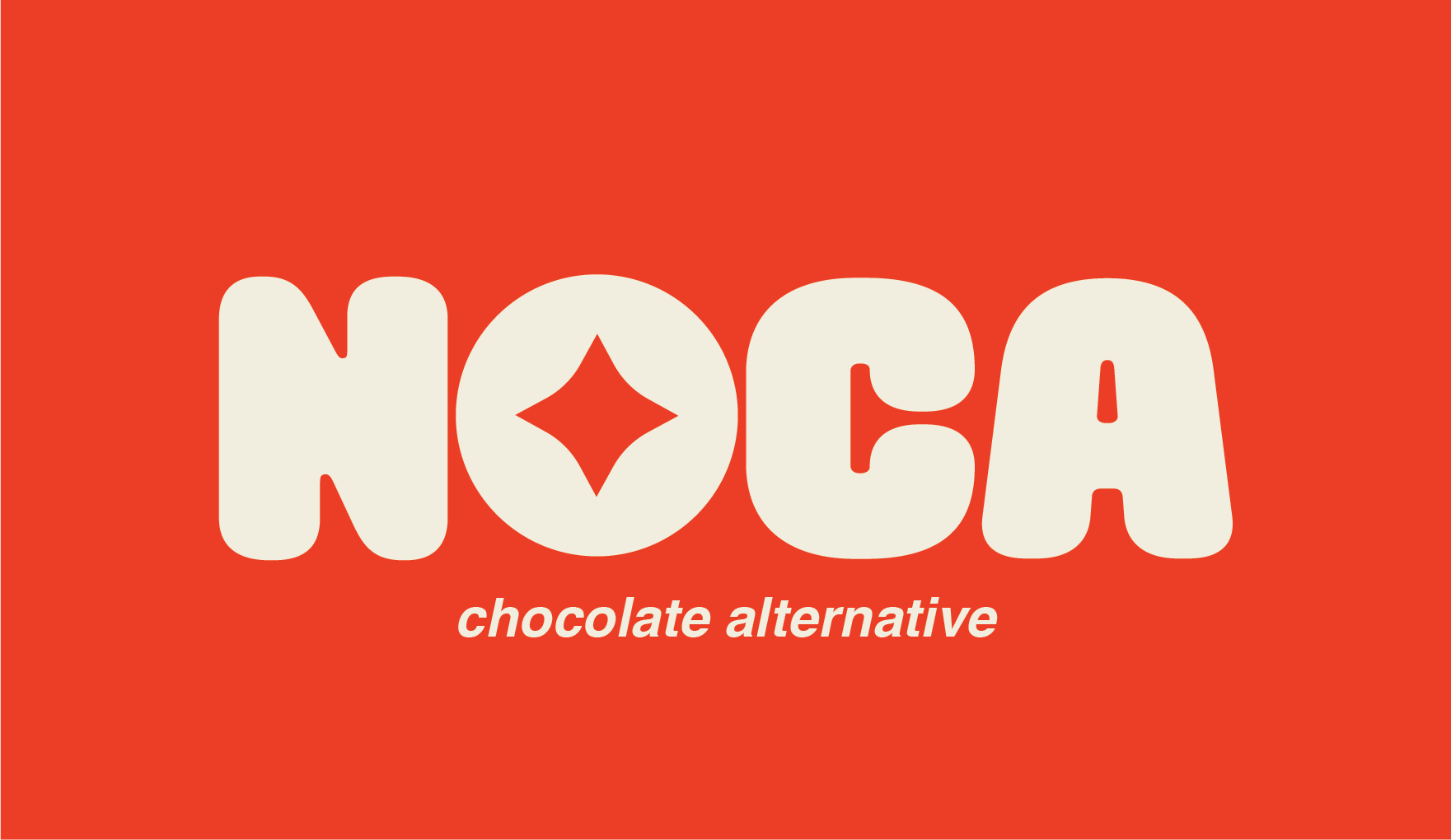
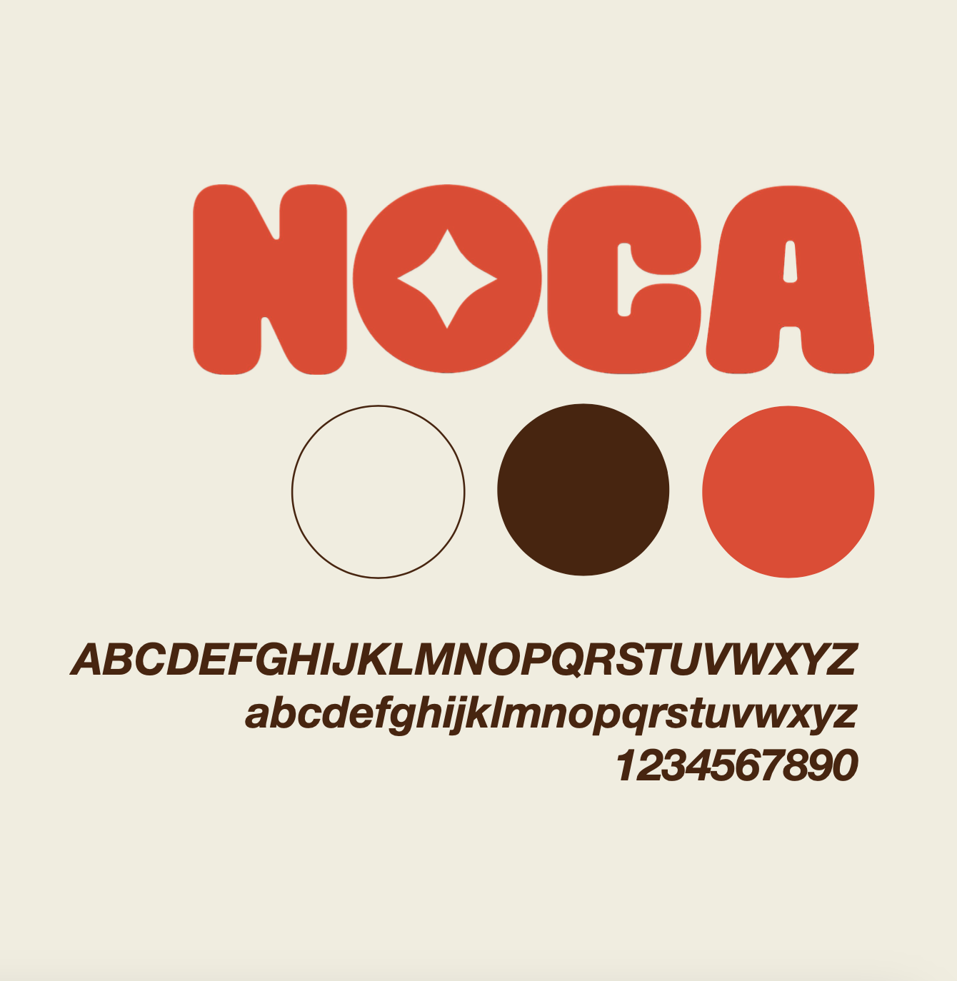
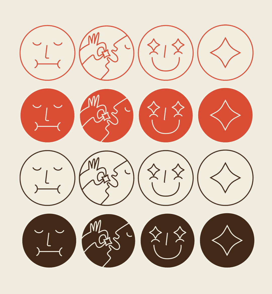
I began this process by putting pen to paper to get a better sense of the letterforms, possible configurations, and color studies. Most of the menus, logos, and signage that I had seen for businesses in the area had clean lines and bright colors. Since I wanted to integrate this product into the context of Danish businesses and eateries, I decided to pursue a minimalist yet bold aesthetic for the brand. While my initial sketches had more quirky, organic forms drawn by hand, I felt that it wasn't hitting the right tone. I opted for a modified bold typeface for the word mark and added bright colors and simple icons to infuse the design with more playfulness.


After getting feedback from an advisor, I decided against outlining the letters in order to make them feel more modern. I also capitalized the letters, finalized my color scheme, and completed the icon library.
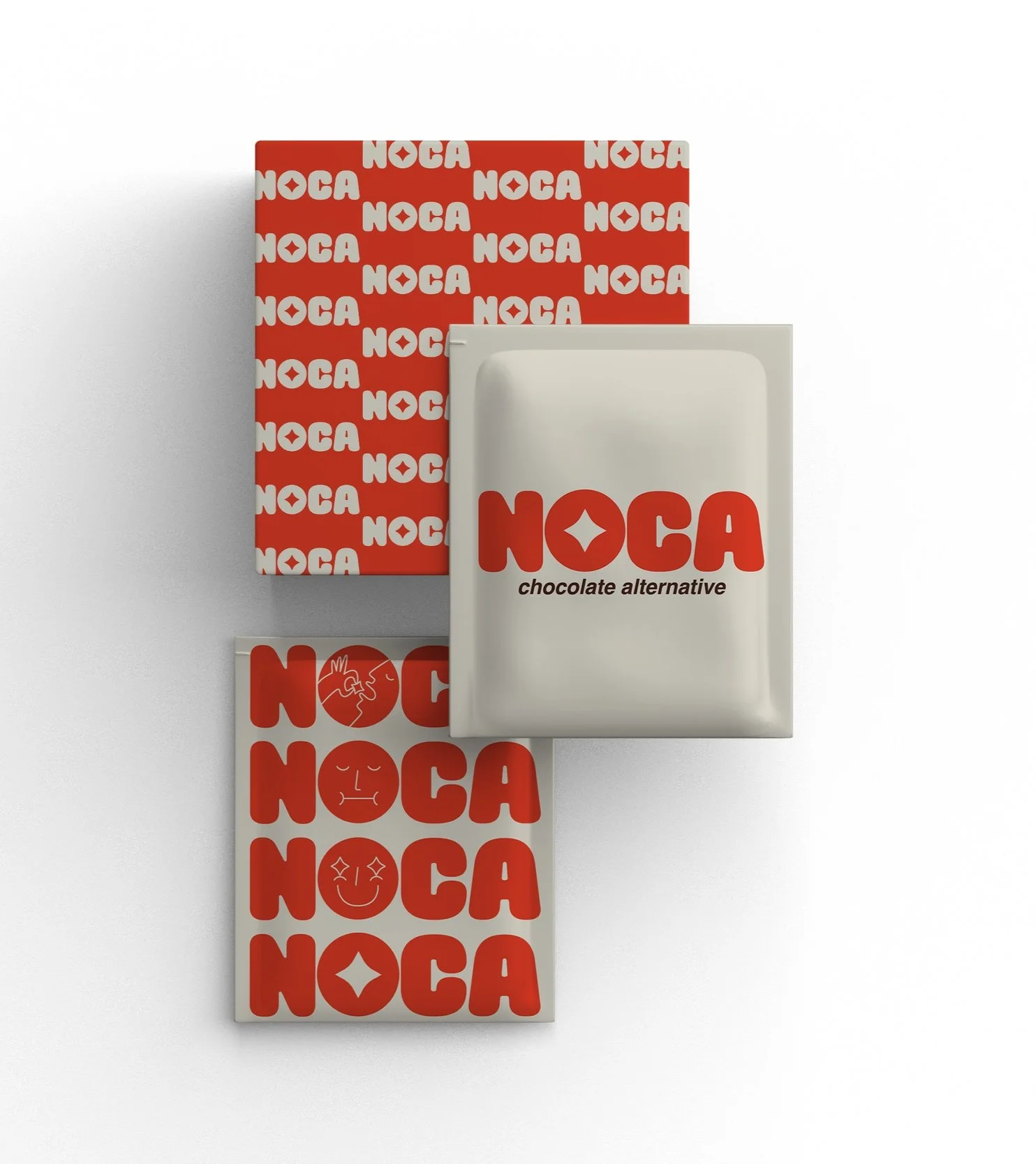
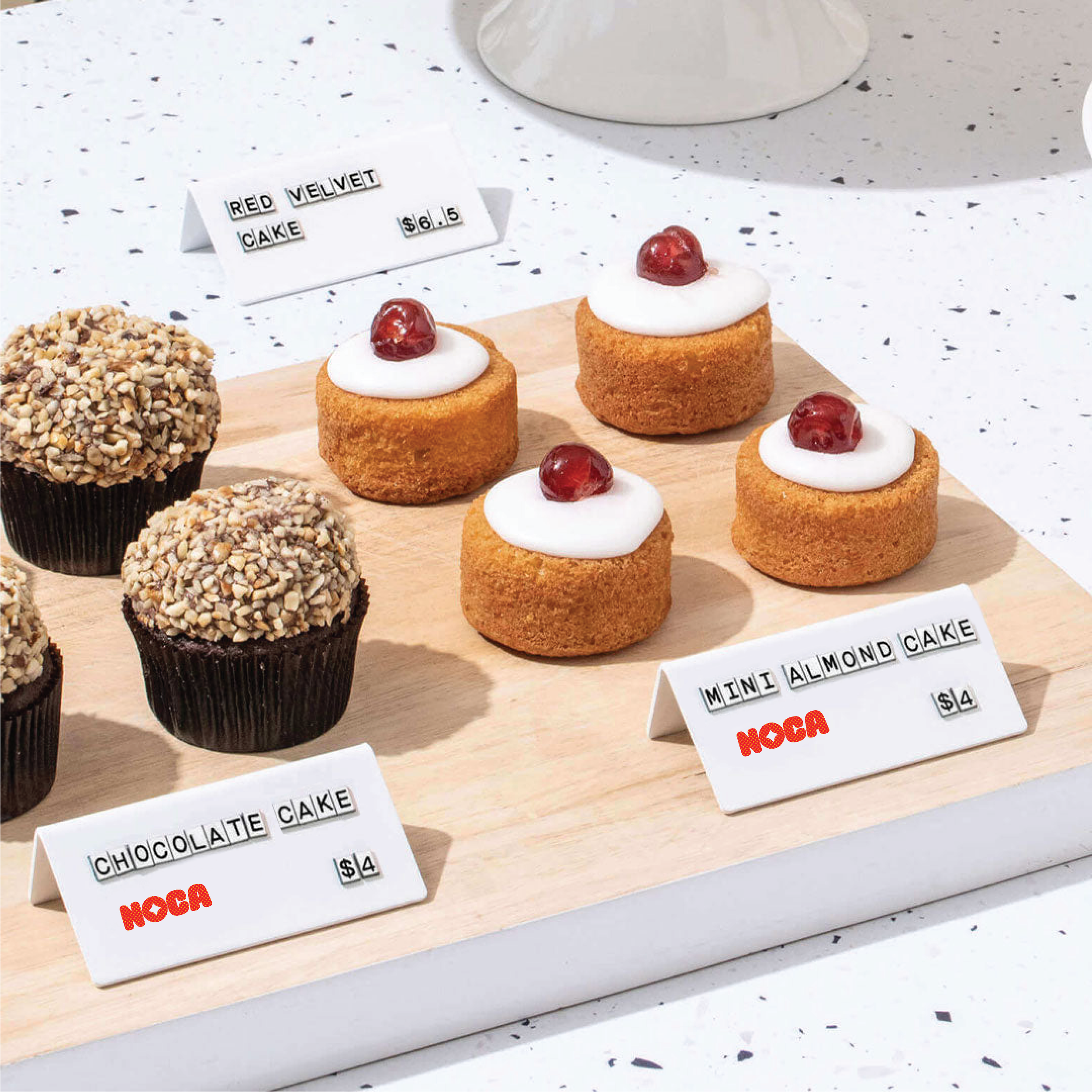
Asset Development
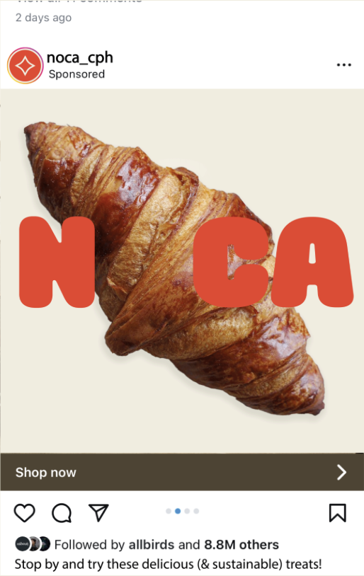
Since this product existed only in ingredient form and was found mostly in existing businesses, I began developing ideas for packaging and feature signage. Since it would be seen as a featured ingredient in bakery displayed or cafe windows, I knew the signage would have to be small but eye-catching. I also wanted to create a media strategy that tied in participating businesses and showcased the (mouthwatering) pastries that used this product.